5 interior colours that will transform a room

Share
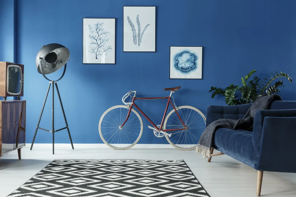
Interior colour choices play a key role in shaping the atmosphere, mood, and perceived space within each room. Every colour carries its own psychological associations and can encourage specific emotions.
Understanding the meaning behind mixing different colours can help people create spaces that match with their desired ambiance. For example, light blue paired with white, and grey can be used for a fresh, modern feel now Spring is coming.
With TikTok searches for ‘interior colours 2024’ up by +1,400% in the past 12 months1, many people are searching for inspiration. With this in mind, the experts at Wren Kitchens have teamed up with colour consultant, Suzy Chiazzari2, to reveal the meaning behind our interior colour choices.
Understanding colour schemes
There are three basic colour schemes that rooms tend to have:
- Tonal is where you choose one base colour and use variations of it through across the room.
- Harmonious is where you use colours that are close on the colour wheel and complement each other.
- Complementary uses corresponding opposites to create a bold statement in the room.
Pink

Pink is often associated with romance and affection. On trend pastel shades can create a gentle and cosy atmosphere, ideal for bedrooms and nurseries. Brighter shades, such as hot pink or magenta, can inject a sense of joy and creativity to the space. Muted shades such as rose provide relaxation, making them ideal for living rooms.
For sophistication, Suzy says, “Pair blush pinks with stone greys to make a harmonious colour match.”
Green
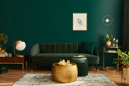
Green is associated with nature and renewal. Lighter shades of greens, such as mint, creates a soothing atmosphere when paired with oak tones, perfect for bathrooms, whereas muted greens as sage and olive promotes the feeling of balance. Suzy says, “Soft neutrals and light cool hues are best in rooms where you want to create a calm relaxed mood.”
In the kitchen, a darker shade of green adds a fresh finish and vibrant pop of colour. Incorporate soft stone greys and warm copper accessories to make the harmonious green stabilise within the room.
Blue
Blue is linked to airiness, promoting a peaceful atmosphere. The colour has a cooling effect on the eye, making it an excellent choice for spaces that tend to feel warm or stuffy. Darker shades of blue, such as navy, can exude elegance. The rich hues add depth to a room if you’re looking to create a timeless ambience.
Blue is a confident colour and does well to brighten up a light grey space, creating a wow factor. Install a backsplash that features both blue and grey elements. Mosaic tiles, or patterned tiles in shades of blue and grey can add texture and visual appeal to the kitchen. Suzy adds, “Bright tones are best kept for sociable spaces and areas where you need some va-va-voom.”
Yellow
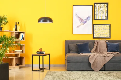
Yellow is an energising colour, linked to warmth and positivity. Sunny shades of yellow light up a room, creating a cheerful and welcoming atmosphere, ideal for entryways and kitchens, and also living rooms where gatherings take place.
Bold shades of yellow make a statement and are used in spaces to radiate confidence. Pair the positive hues with contemporary greys in the kitchen, consider a two-tone approach with cabinetry. Use grey for the majority of the cabinets and introduce pops of yellow for the upper cabinets, kitchen island, or pantry doors. Alternatively, you can choose yellow cabinets for the base units and grey cabinets for the upper units to create contrast and visual interest.
Suzy says, “Colour trends are often linked to the social and economic climate, and people naturally turn to bright happy uplifting colours like yellow when they need mental and emotional upliftment.”
Greys
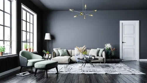
Grey is the most common colour used in the interior space, often associated with timeless elegance and sophistication. Shades such as slate can create an upscale atmosphere, often found in dining rooms and home offices. Lighter shades such as dove grey links to openness, perfect for smaller rooms or areas where natural light is limited.
Pair grey cabinets with countertops in complementary tones. For a cohesive look, choose countertops in shades of white, black, or grey with subtle veining or texture. Suzy says, “Greys and whites have traditionally been used in kitchens for their association with clinical environments, but pairing with crisp light colours, like aqua or leaf green, can also promote a sense of freshness and cleanliness.”
Darren Watts, Showroom Development and Design Director at Wren Kitchens adds: “If you have a small, narrow or low-ceilinged kitchen with little natural light, any dark shades will make the room feel oppressive and unwelcoming. Therefore, your kitchen colour combinations should incorporate a light ‘tint’, as this introduces elements of white within the colour, making it brighter, even when there are touches of darker shades included.
For those with a large kitchen, applying too much white may make it feel sparse, meaning light shades should be balanced with warmer and darker tones.”
With Spectrum from Wren, there’s 1,950 colours to choose from, so you can create your dream kitchen in your dream shade. For more information on interior colours, please visit https://www.wrenkitchens.com/kitchen-design/colour-ideas/how-to-choose-the-best-colour-scheme-for-your-kitchen